Photography
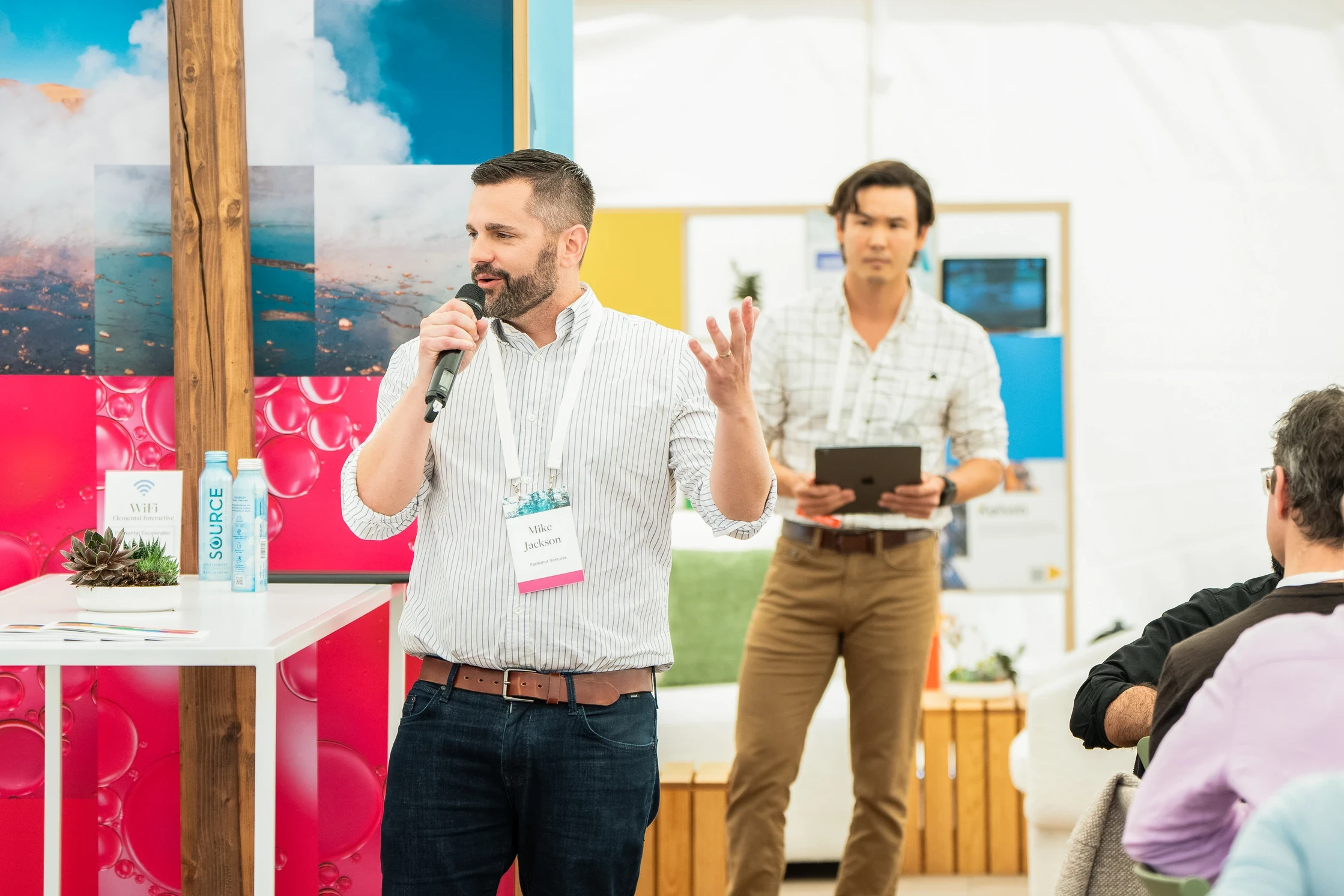
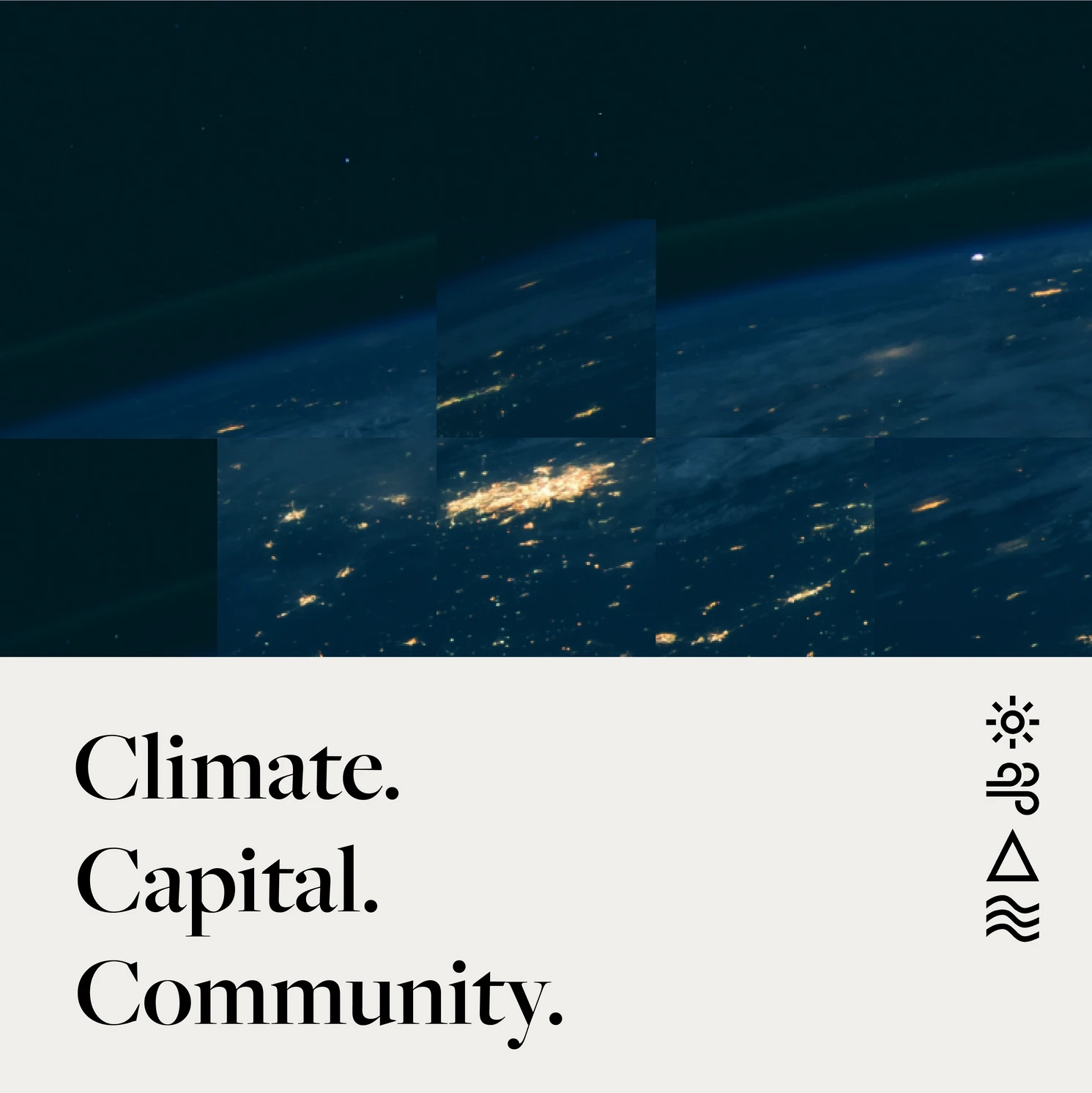
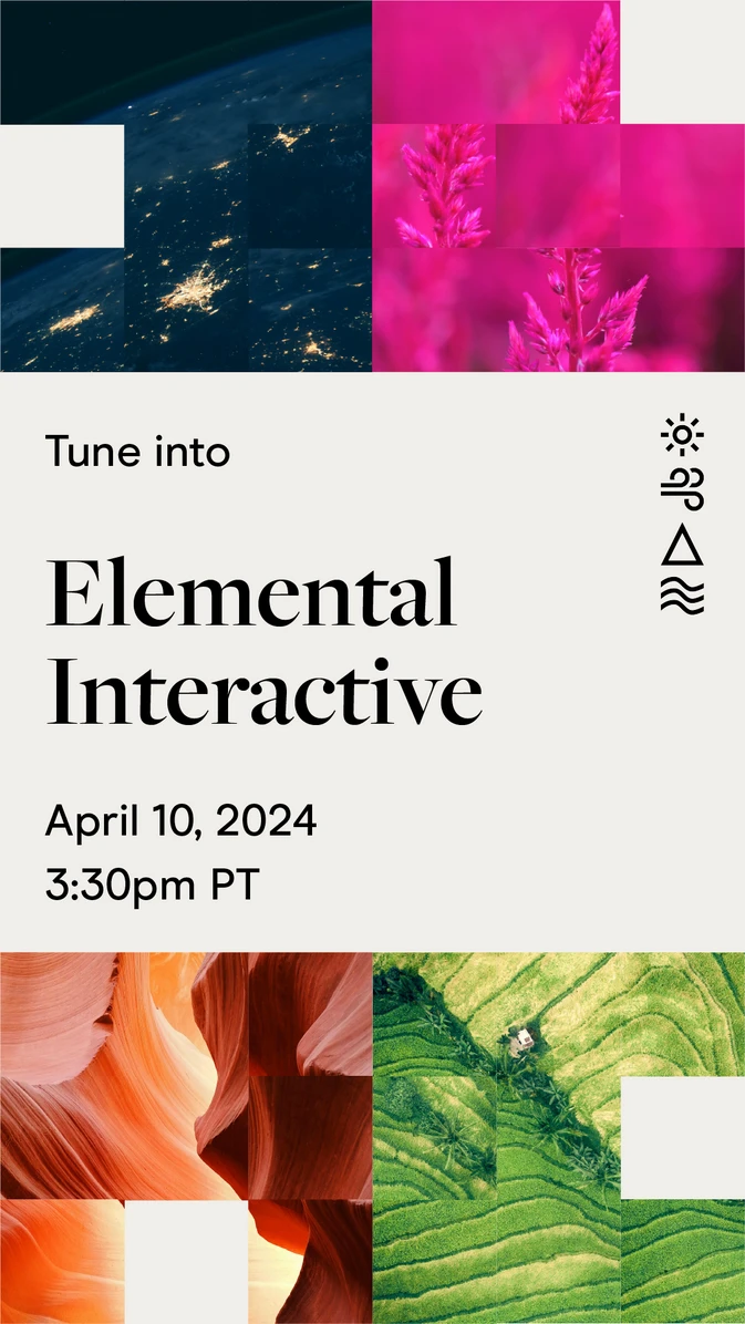
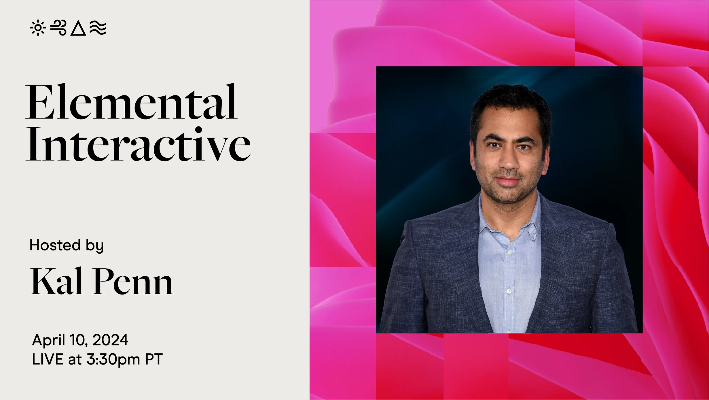
Photography was selected to highlight the nature of the sectors we invest in: the design system: photography, typography, and energy, mobility, food and agriculture, water, industry, and nature-based solutions. Photos used were chosen and manipulated based on subject matter, ease of recognition, texture, color, and composition. Photos were color graded to bring out vibrant natural hues, avoid black shadows, and ground the system in a deep blue aligning with Elemental's core brand and the boldness and vibrancy of the photo configuration. entrepreneurs and innovators we invest in.
Typography
A traditional serif typeface, Freight, was chosen specifically for this design system, and helped us achieve an elevated posture. Balance came with using our brand font, the humanist serif Modern Era, as a body and subheading font, creating a juxtaposition that is like Elemental, able to exist and thrive in many environments.
Photo configuration
Photo configuration, the scrambling nature of the imagery, is the core to the graphic design system. Based on the idea of a slide puzzle, each movement of a tile can shift us into a better viewing position, unlocking progress. The images chosen work as textures while scrambled and static, but came into view through small movements and eventually revealed on stage during the main program








Brand guidelines were created and directed by Jenna with production support from e2k | events x entertainment, Joshua Darby of Studio Question Marque, and Elemental Events Director Lani Cobb, and MD of Creative, Lauren Tonokawa.