Graphic Design
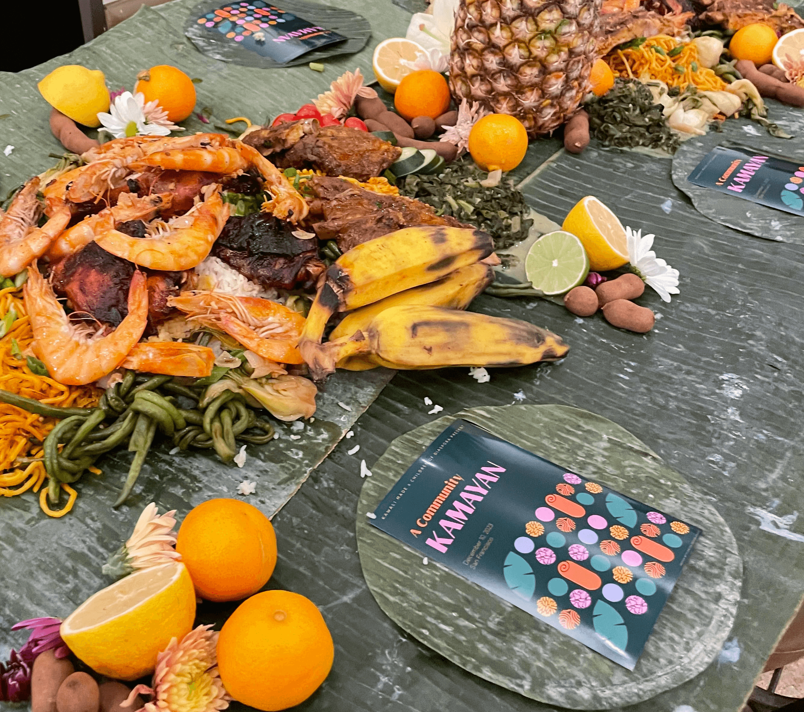
Kamayan
An invite for a traditional Filipino meal

Pacific Climate Summit 2026
Event visual identity for the first inaugural Pacific Climate Summit held in Honolulu, Hawaii
Printmaking


UX-UI
my Hair
A self-built adaptive routine tracker for hair health. Designed, coded, and shipped in a single afternoon — then iterated across three versions based on real daily use.
Maximizing my product efficacy
with a bit of timing help.
A static rotation meeting a dynamic life
I had a written haircare rotation — four weeks, two washes per week, protein and moisture sequenced intentionally. But the moment life disrupted it (a vacation, a forgotten week, a steam room session that threw off the sequence) my brain rejected the whole system. Static plans don't survive contact with a real schedule.
What I actually needed
Not a calendar. A constraint satisfaction engine — something that knew the goals behind each step and could re-derive the right path from any starting point. The workout equivalent: a 4-day split that compresses intelligently to 3 days without losing its goals.
Six design iterations.
One afternoon.
The logic behind
the four-week cycle.
Building it taught me
more than using it.
Design by doing
Six UI iterations in one afternoon — each driven by a specific friction point I noticed in the previous version. The footer buttons needed to recede. The action buttons needed to be terracotta. The rest day needed its own accent color to feel distinct from wash day. None of this was obvious until I used the thing.
The right split between AI and code
The routine logic isn't hardcoded — it's data the app reads from. When a product runs out or the cycle changes, I update the data layer, not the interface. The app stays stable while the knowledge evolves. That distinction — between the container and the content — is the architecture decision I'm most proud of.
Persistence is a UX problem
The biggest version-to-version improvement wasn't visual — it was the persistent today state. Opening the app to a blank form after you've already logged felt wrong. Opening it to a timestamped confirmation of what you did feels trustworthy. Trust is a feature.
my Skin
Retinoids, BHA, clay masks — I had all of it. I also had no idea what to use on any given night. So I built something that just tells me.
Beating laziness by solving
decision fatigue.
Actives without a system are just products
I did the research. I bought the products. Every night I opened the cabinet and stared at six serums, trying to remember whether tonight was a retinoid night, whether BHA and retinoid could share a session, whether dry skin meant skip the BHA or push through. I almost always defaulted to cleanser and moisturizer. The actives sat there doing nothing.
The brief I gave myself
Open the app, see exactly what to do tonight. Full stack, in order, no memory required. If my skin is dry or I'm breaking out, the plan adjusts without me having to think about it. If I'm exhausted, there's a lazy night mode that strips it down to five steps. The routine bends around real life instead of collapsing under it.
Built to survive
10pm, half asleep.
Three actives, seven days,
one rule per night.
What I learned
from building it.
Color as information, not decoration
The step number circles are color-coded by active type: powder blue for BHA, raspberry plum for retinoid, olive for mask. After a few weeks of use, the color pattern becomes legible at a glance. You stop reading the routine and start recognizing it -- and recognizing it means you actually follow it.
The skin state as a decision tree
Dry, breaking out, lazy night -- each state modifies tonight's assigned routine without replacing it. On a dry night, BHA gets swapped for extra snail mucin and the ceramide moisturizer comes out. On a breakout night, there's a pimple patch prompt and retinoid gets skipped. The logic lives in the app. I just tap a pill and follow the steps.
Persistence as a trust signal
The most important UX detail wasn't visual. It was the timestamped confirmation on reopen -- "Logged today at 8:25 pm" -- that removes the doubt loop of did I already do this? I kept reopening the app just to check. Building in the answer to that question made the whole system feel reliable in a way the blank form never did.
Conversation as design process
Before any code, there was a long conversation -- skin concerns, product inventory, goals, weekly rhythm, compatibility rules, edge cases. The architecture came out of that conversation rather than being imposed on it. This is the part I keep thinking about: the best design I've made for myself started with articulating what I actually needed, out loud, before I tried to build anything.