This report is titled A Year of Extremes, because 2025 split the field: some of our companies spent the year surviving policy whiplash and a closed capital market, others rode Al and infrastructure demand to their best year yet. The report had to hold both stories without flattening either.
The report is one of our most effective fundraising tools. It goes out as a pre-read before donor conversations at our tentpole event Elemental Interactive at San Francisco Climate Week and as a way back in with prospects who have gone quiet. So the brief wasn't "summarize the year." It was: convince someone that of all the places they could put money in climate, this is the right one - then show them where last year's money went, and be transparent enough about the finances that the question doesn't have to be asked. It's also a document built by committee, with 25 writers and editors across the organization contributing, including the Creative, Communications, Portfolio & Investment, Growth, Partnerships, and Leadership teams. The art direction and design was directed by me, with graphic support from contractor Mrinal Joshi and pre-flight support by Joshua Darby.
The cover visualizes the title. A single photograph with one rectangle inverted against itself - same image, opposite reading, neither one winning. This is a year of extremes, and inside, the report delineates how we interpret that.
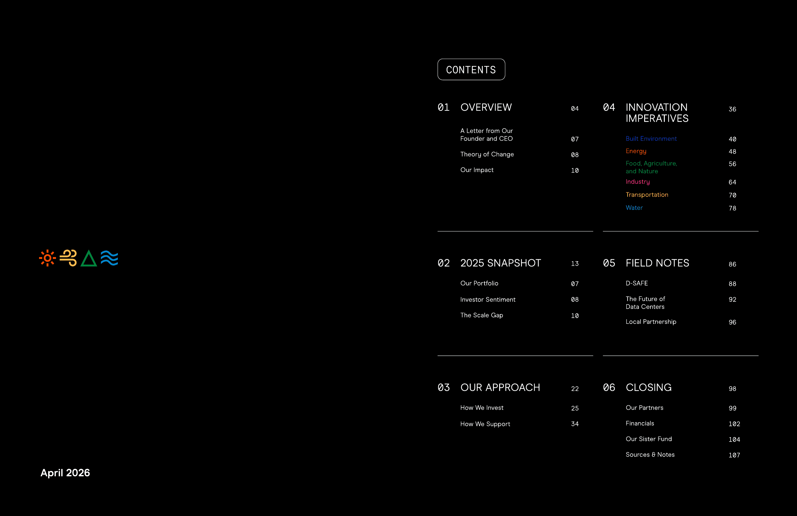
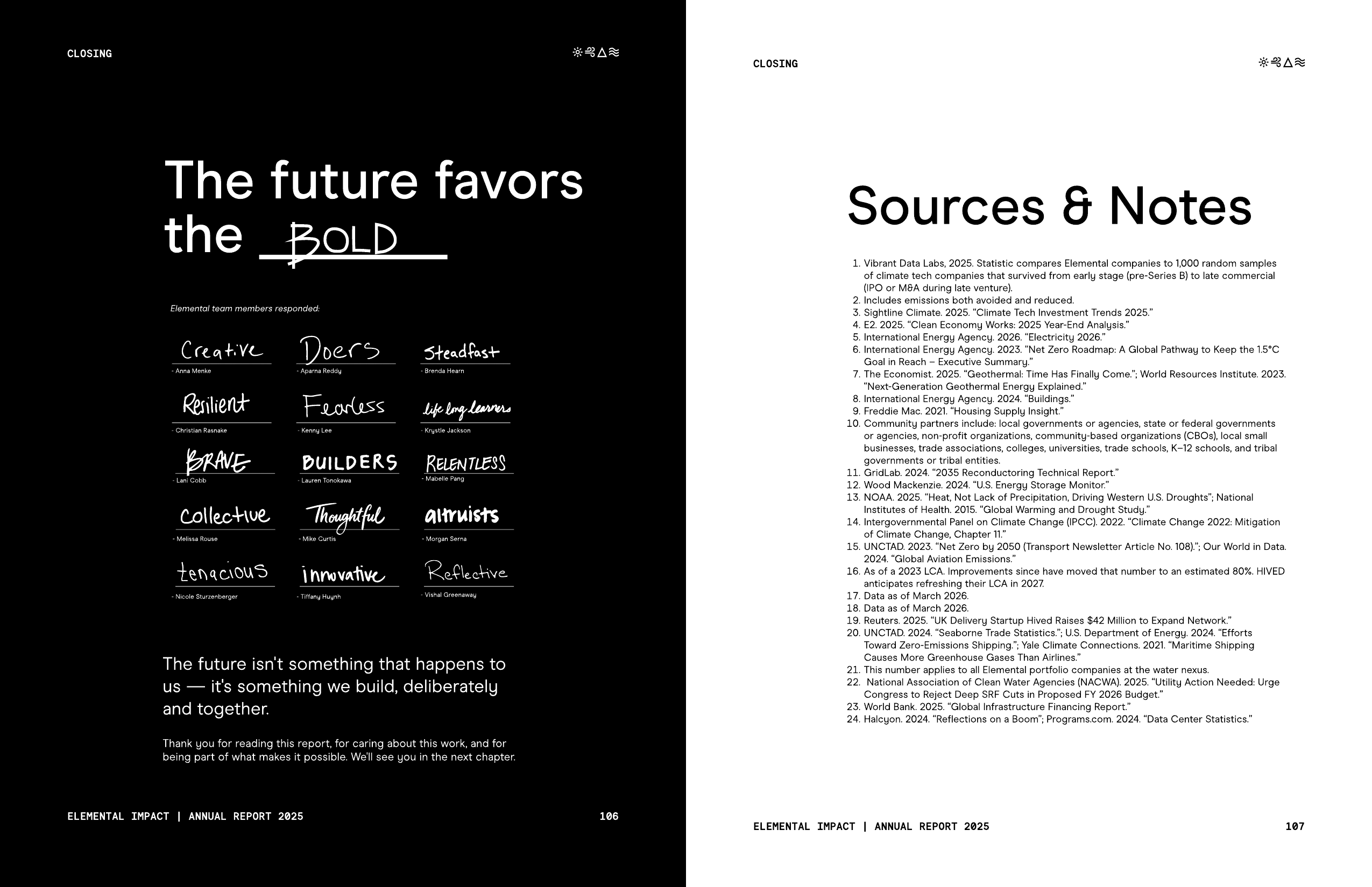
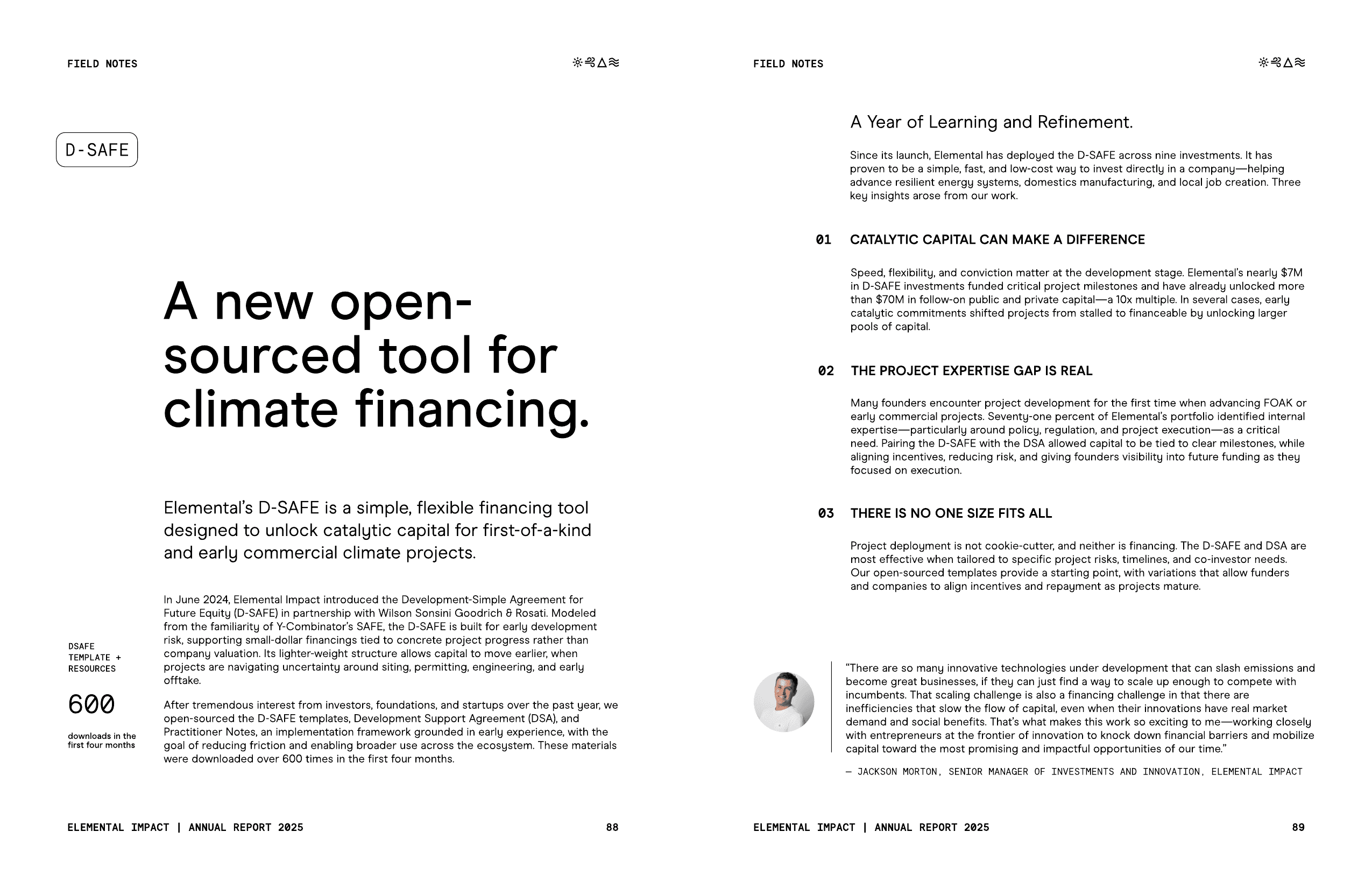
The narrative arc moves from the state of the field, to what we did, to what it produced, so a skeptical reader and a committed one can enter at different points. Hierarchy does the rest - strong H1 headings per section to ground and help the reader make quick sense, uppercase mono pre-heads for wayfinding, H2s with a thesis, body paragraphs that connect the dots. Pull stats and data viz for the left brain, testimonials and photography for the right. Light touch markups and circles for a small nod to the humans writing and reading the report.
Most of the design work was reductive: deciding what leads, what stays, and what gets cut. How to employ repetition, rhythm, and so the viewer can guide themselves through the report, and find what they're looking for. Brand photography of our sectors and the elements carry section dividers for relief, and project specific photography appear where referenced. It was an art of balancing demonstrating our competency with strategic restraint.